Brand
Guidelines and assets
How the logo, colors, and type are used. Assets on this page are for press and partners. Questions go to [email protected]
01
Logo
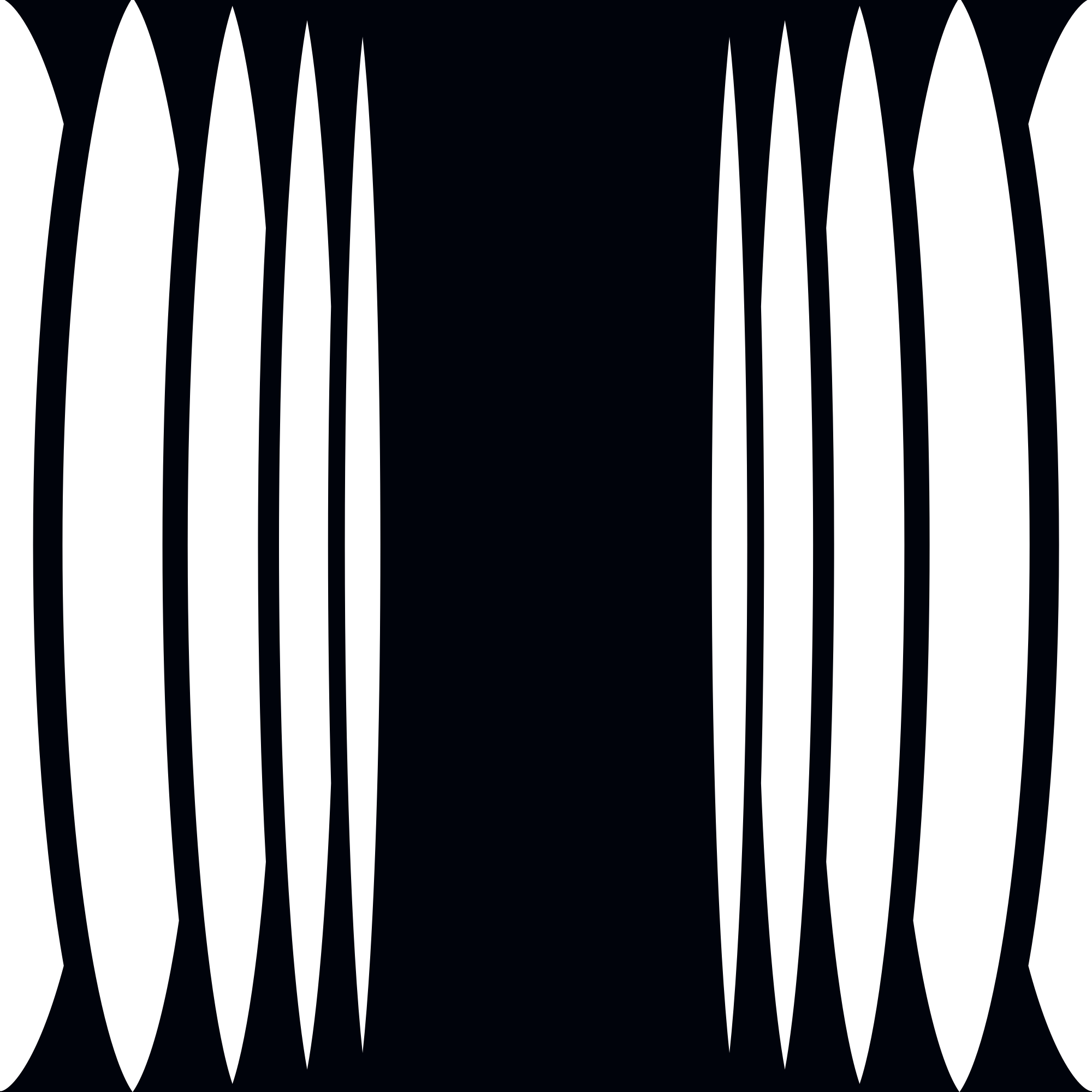
One mark: the barcode symbol beside the wordmark. Five variants cover every placement; pick by context and size, never by taste

The default lockup for partners, press, and external placements

Square and portrait placements: covers, end cards, profile images

Where the brand is already present. Use at 75px height or larger
Below 75px: navigation bars, avatars, favicons

Where the symbol already appears nearby

Two inks only: ink #00030B on light backgrounds, off-white #FAFBFF on dark backgrounds
- Monochrome only. Ink on light backgrounds, off-white on dark backgrounds.
- Scale proportionally. Never stretch, compress, or rotate.
- Keep at least 1x of clear space on every side. 1x is half the gap between symbol and wordmark.
- The full symbol's fine bars need 75px of height. Below that, use the small symbol.
- The logo never carries a descriptor or tagline. Surrounding copy states what we do.
- “Relayzero” is sentence case. Never uppercase, even inside uppercase display blocks.
- Recolor it, add gradients to it, or set it in an accent color
- Add shadows, outlines, or effects
- Place it on busy or low-contrast backgrounds
- Redraw, respace, or rearrange the lockup
- Use the full symbol below 75px tall
02
Color
The foundation is black, white, and gray. Depth comes from grayscale gradients and silver. Accents appear only when they do a job: a small categorical marker, distinguishing series in a chart, or flagging one key item. Never as large fills. When in doubt, stay monochrome.
RGB 0, 3, 11
The canvas. Dark backgrounds and the logo's dark ink
RGB 36, 39, 47
Raised surfaces on the dark canvas
RGB 70, 75, 87
Borders, dividers, hairlines
RGB 115, 120, 131
Muted text, labels, eyebrows
RGB 196, 204, 216
Marks, dots, and rules that need more presence than gray
RGB 250, 251, 255
Text on dark and the logo's light ink
RGB 237, 88, 88
Categorical marker or one flagged item
RGB 102, 195, 147
Categorical marker or a positive series
RGB 68, 112, 224
Interactive elements: buttons, links, focus
#646D81 → #FAFBFF
#FAFBFF → #00030B
#00030B → #000000
#646D81 → #191B1D
Grayscale linear gradients are a brand signature, used behind logos and as metallic depth. Keep them subtle: never strong enough to hurt text contrast.
03
Typography
One typeface: BDO Grotesk, in Regular, Medium, DemiBold, Bold, and Variable
Headers
Sub header
Main text is set light, sized to read
- Medium carries headings and the wordmark. Display headings are uppercase.
- Light and Regular carry body text.
- “Relayzero” stays sentence case in any type setting.
The brand typeface is commercially licensed, so no font files are offered here. When BDO Grotesk is unavailable, use Manrope. Free on Google Fonts and usable across Google Workspace: Manrope on Google Fonts